The Project
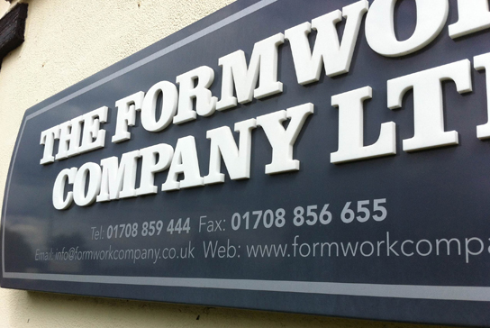
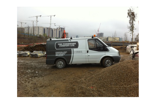
The Formwork Company Brand Design – The directors of The Formwork Company Ltd have been in the Formwork business for over 15 years and come from a long line of family run businesses in the same field. The Formwork Company Ltd wanted a logo that reflected the long standing and traditional values of the company as well as being relevant today. Clarendon is a very hard working font that copes well with contemporary and traditional typography. Clarendon Black in uppercase, framed with a simple plate that represents the stamp of quality craftsmanship, is exactly what the client was after.
The Formwork Company wanted a website that showcased their work. An easy to navigate Brochure site that had CMS capabilities and could facilitate growing content was designed and developed to meet their needs. Due to the success of the site our client reported an influx of work, taking on prestigious contracts for the development of the 2012 Olympic Village.
formworkcompany.co.uk


